Innovative web design nowadays means high-quality images, tall pages, fewer links and more buttons with large clickable area. This all happened thanks to one thing that has changed recently.
This is all about scrolling. Scrolling has become an easy process comparing to old-fashioned scrollbars on the side of a screen. Today it is easier to scroll than it is to click. More and more people browse websites on their mobile devices. On mobile devices it is harder to click on a target area, but scrolling is an absolutely natural process.
Old websites targeted at short pages with maximum information and links squeezed in one screen. The new, innovative web design is aimed at scrolling at the first place. What considered to be ineffective and inconvenient a couple of years ago is now fully acceptable and welcome.
The new scrolling culture made one-page websites so popular. There is no need to create a complicated site maps and huge menu bars. A one-page website carries customers through a well-designed system of arguments, pros and cons to a single action that a website visitor is expected to take at the end of the journey. When customers are saved from endless website surfing in search of information, they stay more focused and they are more likely to take a required action.
Another hallmark of innovative web design is large high-quality images. When scrolling is so easy, designers are free to fill websites with large beautiful images. Important information will not be missed in the middle of the page, or even on the bottom. Great images inspire users to scroll for more information. Images make brands more emotional and open for customers.
Modern technology dramatically changes approach to innovative web design. Design patterns that were unacceptable a few years ago today prove to be highly effective. All the rules may be turned inside out only because of one thing that has changed in the way in which users interact with websites.
There are thousands of free and premium WordPress themes on the market. It might be hard to choose one. And before you make a choice, think of how a theme would affect your website credibility.
Professionally looking themes work for website credibility.
Broken images, fonts or links, messy design create an impression of a poorly organized business. The harder to make your prospects trust you, the more professional and thought-out your theme should look. You can use free themes for a small blog or websites about your hobby. But if you plan to reach out some large audience, better think of choosing a premium WordPress theme which is well-supported and can be easily customized to your needs.
Consider your target audience.
If your audience are teenagers, they are not going to respond to a corporate website. If you sell pizza, your website should not look like you sell jewelry. Your website design can be compared to your clothes. You wear suits in the office, and shorts on the beach because it is appropriate for the situation.
Before you choose a theme, find out what your audience likes. You can take a look at your competitors’ websites or browse social profiles of your prospects.
Support your brand.
if you already have a brand-book for your offline business, apply the same design to your website. Your clients should understand on the first glance that the website belongs to your company. If you use different styles and colors for your website, it will look like a fake. People won’t like to make purchases on such a website or trust the information on it.
Mind the speed.
You need to make sure that your website loads fast, especially on mobile devices. You might want to use less images and plugins to make your pages load fast.
Add your contacts.
It is necessary to write your office address on your website. But the contact information will look more credible if you add a piece of map on your contact page. It will prove your clients that your address is real. Also it will be easier for clients to find directions to your office.
Website credibility is important for your online sales, and choosing the right theme is a big step towards it.
There is a huge choice of WordPress themes on the market now. Sometimes you have to try several themes on your website before you come across the one that fits your needs. If you are not experienced in choosing themes, it may take you a while.
When you look for a WordPress theme you should consider a few things. They will simplify the search process and prevent you from possible problems with the theme in the future.
1. Auto updates and support. This is what will save your nerves and money in the future. Poorly supported themes may easily dissolve your great impression of design and features. When a problem arises, it may be too late and too costly to change the theme. Pay attention at themes that are developed by teams who provide ongoing support, no matter if you consider free or premium themes.
2. Choose a responsive theme. If you go with a non-responsive theme, you will have to develop a dedicated mobile website. Otherwise your website will be lost for mobile search. So why do extra job if there are already plenty of beautiful and well-developed responsive themes.
3. Nice design an ease of customization. Theme design should be good looking and serve your needs in the best possible way. Play with demo to see if design is appealing to you, and take a look at the admin panel, if possible, to see of the theme is easy to customize, because in 90% cases you will want to tweak it, at least a bit.
4. Search for SEO-friendly themes. Though WordPress is a very SEO-friendly platform, a badly coded theme may do an ill turn. Select themes with “SEO optimized” or “SEO ready” mentions in the description. Check if they are really SEO-friendly with a MozBar or SEO Site Tools extensions for Chrome.
5. Choose a translation ready theme when you need it translated to a language other than English. Or search for a theme in your native language. Mind that you cannot just translate a WordPress theme changing the language in the source files. If translation is important to you, decide on localized or translation ready themes.
Are you ready to give your website a divine transformation? One of the ways you can achieve this is with the use of high quality WordPress themes. Most WordPress themes are high quality WordPress themes, and you will rarely ever have a problem with any of the WordPress theme lines, at least up to date anyway, as many millions of websites have ran smooth without a hitch, making them one of the greatest platforms for internet publishing around.

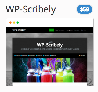
But even though the platform is amazing, there are still a ton of variations and options on themes that you can choose from. For instance, there are some of our in-house high quality WordPress themes like Scribely:
It is considered a high quality WordPress theme because it uses many plugins and add-ons that allow users to have a dynamic site as well as plenty of options to choose from. From a web-page viewers’ perspective, the interface is quite graphical, making it easy for viewers to navigate. But what if nothing lines up and the images are blurred and things overlap between columns and the main message body?
If that happens then the quality of the post goes down, and the WordPress theme will not be seen as high of quality as the high quality WordPress theme. For the utmost in quality, and a level that puts your website into the pack-leader category, you should get a package of our themes. We have 36 high quality professional themes that will be sure to give you plenty of options into the coming year!


